SiriusXM
Reimagining satellite radio for a new generation
As a design leader at SiriusXM, I have been responsible for leading the redesign of the SiriusXM listening app for iOS, Android, and the web. My role involves not only designing for multiple platforms, but also building and leading a design team and implementing modern design practices. In this case study we’ll walk through how we took a dated satellite radio app and created a new modernized architecture and aesthetic for our users.
My Role
Director of Product Design, Designer, Researcher
Platform
iOS, Android, Web
Industry
Audio, Entertainment, Advertising

The Acquisition
In July 2020, SiriusXM acquired Stitcher for $350 million, gaining control of its podcast network, podcast advertising business, and the podcast listening app that my team had redesigned and relaunched. We quickly built relationships and sought to understand how our project fit into the company's larger vision.
At the start of 2021, I created a new team to lead the design of the SiriusXM streaming app with the focus on modernizing and improving the user experience. The team was composed of the Stitcher design team reporting to me, existing SXM design team members, and new hires.
The application had become neglected, causing user complaints of confusion, a cumbersome structure, and an outdated look-and-feel. We worked to develop a positive team culture, a flexible process, and begin to improve the user experience.

Making A Kick-Ass Team
I set about creating a team culture informed by the lessons I had learnt at Stitcher. We focused on creating a mission statement, establishing a rapid process, and instilling a sense of team values.
We wanted to ensure psychological safety within the team, so we spent hours on Zoom, discussing the app and getting to know each other. We co-created a set of Values and “Anti-Values” to help us communicate and hold ourselves accountable. This bold and clear approach to our mission helped us form strong working relationships.


A Modern Design Process
I sought to define a modern, clear process for conducting work and reaching goals. This process included a weekly sprint cadence, daily check-ins, and reviews with an emphasis on user-testing. This allowed us to quickly launch into deep discovery work.
I created a deck to review each week, which helped the team to reaffirm our process and values, review the Now/Next/Later roadmap, and stay focussed. This deck became the cornerstone of our week, giving anyone in the team or organisation an understanding of who we are, our objectives, and how we get work done. Clarity = Confidence.


Mapping The Problem
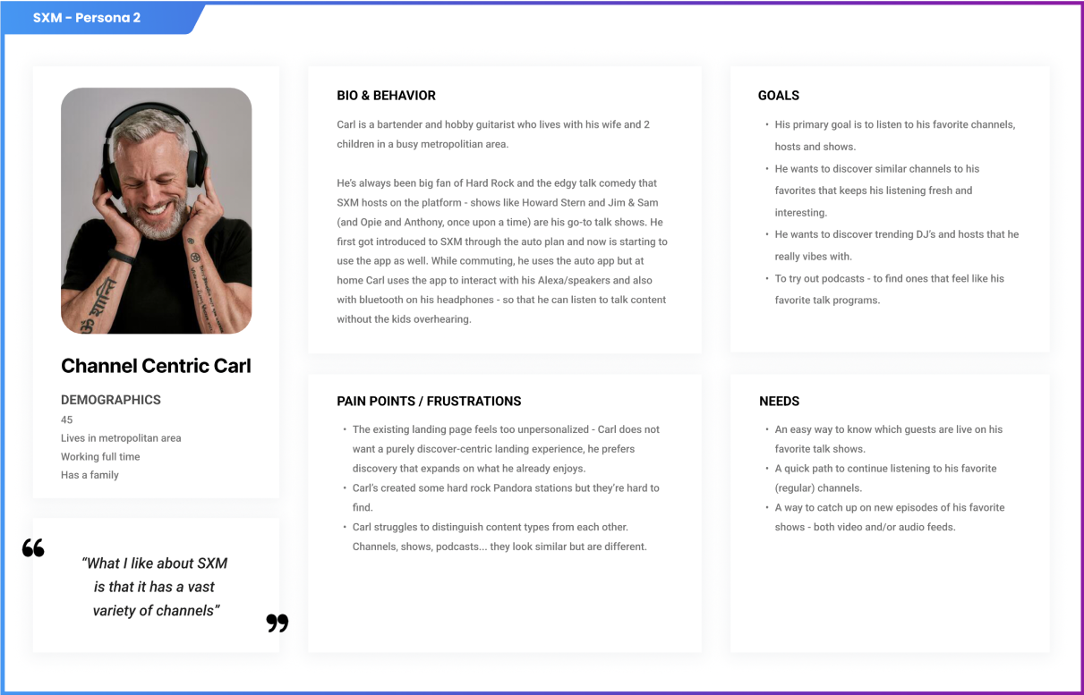
To create an effective solution to the problems we identified within the SXM streaming app, we had to dive deeper and gain a better understanding of the users. We conducted an in-depth user research to identify user needs and behaviors, which enabled us to create personas that effectively represented the needs of our target users. With this understanding, we were able to develop user flow diagrams that detailed the steps our users went through as they interacted with the app.
We also established design principles for the app that encompassed the wants and needs of our users, so that our solutions would meet their demands. Finally, we adjusted the information architecture, content structure, and design language of the app to make it more intuitive and user-friendly. Through this process, we were able to create a modern version of the SXM streaming app that is both usable and delightful for our users.


A Simpler Architecture
To ensure that our solutions addressed the issues with the app's information architecture, content presentation, and overall presentation, we developed a comprehensive research plan. This included creating a set of low-fi mockups of three prototypes of three drastically different IA's and conducting a dozen moderated tests. These tests asked both new and existing users what they thought of each idea, giving us a quick gut-check calibration on what users expected to find in each screen and how they felt about different navigation patterns. We also took a qualitative look at the user experience and analyzed feedback from users to identify pain points and areas of confusion.
Through this research, we were able to develop an intuitive, user-friendly information architecture and design language that improved the overall user experience.

We quickly eliminated the ideas that users didn’t understand or that did not fit our business objectives. We arrived at a new layout that test users reported as being simple, intuitive, and refreshingly clear.
A big win for the team!

Going Dark (Mode)
Alongside our information architecture work-stream we had been reviewing competitor apps and starting to notice other areas we could improve. We conducted deep audits of all of our most successful competition and became aware that world leading content experiences such as Netflix or Spotify, optimized their colors and typography to make their content “pop”. SXM had traditionally had a brighter color style, where even the darkest colors were a set of low-saturation grays.
Through visual explorations and design sprints we found that using a darker palette of blues and blacks would help emphasize our unique content, and gave the app a modern fresh feel. We collaborated with our partners in product and decided to make the app’s “Dark Only”, better aligning with the overall brand direction.

Designing a New Design System
We wanted to equip ourselves with the latest design tools and streamline our design process, so we developed a Design System that enabled us to do just that. It was composed of simple, reusable components and comprehensive documentation and usage examples that made it easier to understand the intended use of each color and element. This improved clarity and communication between designers and engineers, and allowed us to create a meaningful partnership. As a result, design was given a more prominent role in the engineering process and helped to bridge the gap between the two teams.

Reception and Business Impact
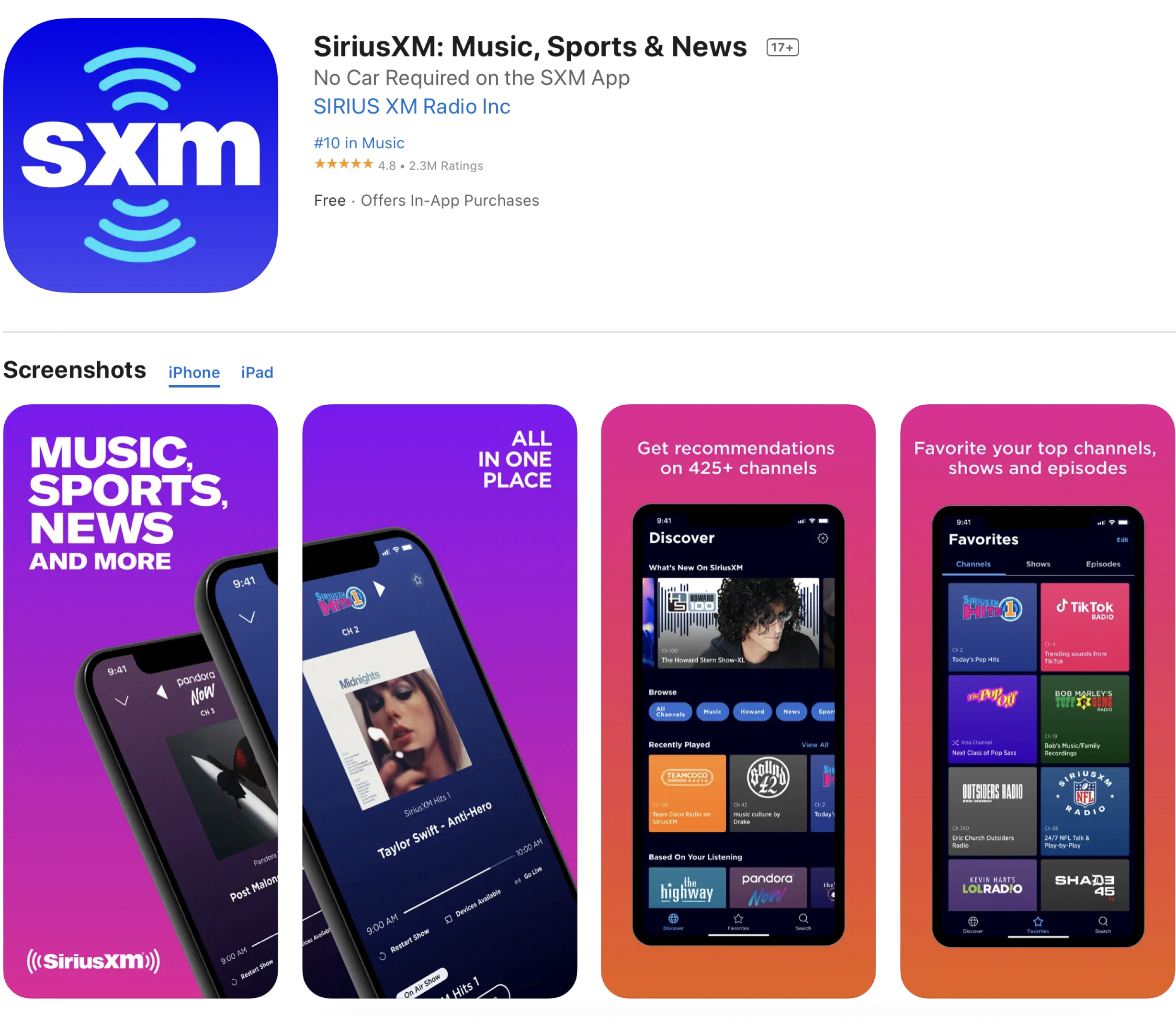
The new iOS, Android and Web designs launched on Nov 2022 and were very positively received. We collaborated with product and marketing teams to create new App Store designs, descriptions, and marketing materials. Users responded enthusiastically to the new layout and reported that, much like our testing showed, it was easier and faster to get to the content they cared about.
The new visual design language and color palette modernized the look-and-feel of the experience and had an outsized impact on user perception. We saw an immediate rise in user retention and an increase in overall user activity, particularly in the Browse/Discover sections. The update was featured at SXM’s investor day and the CEO demoed the app on CNBC.
The team's greatest success was the new foundation it created for the future of the SXM streaming product, opening the door to even greater design and feature improvements. SXM enjoys a 4.8/5 star rating on the App Store, and is in the top 10 of US music apps.


Legacy and Lessons
The redesign of the SiriusXM streaming app and website was a highly educational experience. It solidified key lessons about team structure and leadership, in particular related to the importance of regular sync cadence, clear team values, and external communication.
SiriusXM was also the largest tech company I had worked for so I was prompted to become a better communicator, more able to get stakeholder buy-in across teams and departments.
Our efforts paid off and the new iOS, Android and Web designs launched on Nov 2022 and were very positively received. We collaborated with product and marketing teams to create new App Store designs, descriptions, and marketing materials. Users responded enthusiastically to the new layout and reported that, much like our testing showed, it was easier and faster to get to the content they cared about.
The new visual design language and color palette modernized the look-and-feel of the experience and had an outsized impact on user perception. We saw an immediate rise in user retention and an increase in overall user activity, particularly in the Browse/Discover sections. The update was featured at SXM’s investor day and the CEO demoed the app on CNBC.
The team's greatest success was the new foundation it created for the future of the SXM streaming product, opening the door to even greater design and feature improvements. SXM enjoys a 4.8/5 star rating on the App Store, and is in the top 10 of US music apps.